I’ve been looking at a lot of resumes recently, and I find myself annoyed every time I come across a “Professional Skills” section that depicts filled up bars with a percentage that indicates the level of the candidate’s proficiency in certain areas. I see this especially on the resumes of young designers and front-end web developers. Some experienced folks also use this, perhaps believing that it makes their resumes more interesting and visually appealing.
Here’s a made-up example of what I typically see:
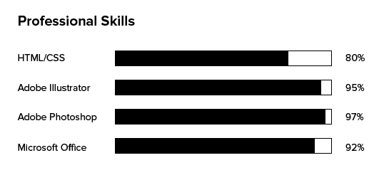
This chart tells me a few pieces of information that I might categorize as somewhat useful:
- How confident a candidate feels about a certain tool or skill area; if they’re going to mark something close to 100%, then they must be very confident in their ability
- How the candidate rates his a particular skill in relation to other skills; I can quickly compare their self-rating and get an idea of how the candidate gauges his strengths
But here’s where I get frustrated: what the hell does 100% even mean? And how is the candidate coming up with these numbers? How can you tell the difference between 95% proficiency in one skill versus 92% in another? Whenever I come across a chart like this, I never see a footnote or an explanation that tells me how these numbers were derived and against what standard they were measured. If I see that you put 97% for your Adobe Illustrator skills, am I to assume that you’re better than 97% of all designers who use Adobe Illustrator? Or is the 97% in relation to other candidates with your level of experience? Without context, a graphic chart like this creates confusion and, for me personally, raises suspicions.
Here’s what I look for in each job application, and it goes beyond the resume:
- A short and thoughtful cover letter explaining why you’re applying to the position and why you think you’d be a good fit. It helps to be specific about why you think you’d be a good fit at our company in particular. It’s really easy to tell when a candidate is using a carbon copy cover letter.
- A very scannable resume that succinctly lists relevant work experience (where, for how long, and responsibilities), education, and relevant skills (just a list is fine)
- For designers especially: a link to a portfolio that showcases relevant work examples preferably with details on what you actually did on the project (I sometimes find that junior level people take credit for someone else’s creative direction, and I also find that some experienced people take credit for someone else’s execution; it doesn’t hurt to just be upfront about what you did and didn’t do if you’re going to include it in the portfolio)
- Bonus: I love coming across candidates who write, whether it’s about their craft or about their perspective on different issues and topics.
Too many times, I see applicants who forgo the cover letter and don’t include a link to a portfolio even when we’ve specifically asked for it in the job posting. For each open job position, we often review hundreds of applicants. Rather than spend time tinkering with a graphic showing skills proficiency, I think candidates would be better served with a compelling cover letter and, if applicable, an interesting portfolio.
Love this take! those little skills charts might seem cool, but without a way to explain how the numbers are calculated, they actually raise more questions than they answer.